Avaloq
Powerful reporting, polished brand consistency
Bringing Avaloq’s reports in line with the new brand identity
When a brand like Avaloq evolves, every touchpoint matters, especially the ones that communicate crucial information. ifour was asked to review and redesign a set of five English reports on their website. All too often, it can be easy to get excited by the fireworks of core brand assets like a website, and overlook the power of presenting the brand beautifully, over and over again.
The goal here? Align every element with their updated brand guidelines, ensuring the reports not only look the part, showing up consistently with the wider brand presence, but also function seamlessly for a digital-first audience.
– Branding
– Collateral
– Social
‘Redressing’ current reports
With the focus on the primary assets and channels, much of the new brand was already in action, but secondary assets – including a set of reports available on the website – were still playing catch-up.
While live and functional, the five core reports still ‘wore’ the previous branding and no longer reflected Avaloq’s new brand look and feel. More critically, subtle inconsistencies in layout and content formatting were affecting both visual polish and user experience.
Avaloq needed a meticulous, design-led refresh – one that respected the original content but brought it into full alignment with the current brand.
Auditing the back catalogue
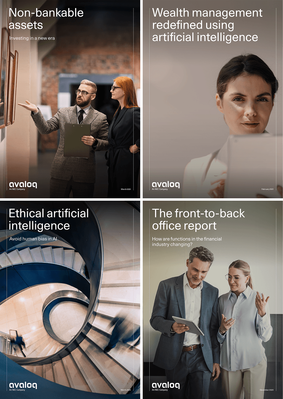
We began by dissecting the reports using Avaloq’s latest brand guidelines as our benchmark. The new grid system was central to this – a foundational element that determines how content flows, aligns, and connects visually.
Each report was reviewed page-by-page to identify deviations from the grid, inconsistent margins, misaligned text blocks, and typographic mismatches.
Alongside the visual audit, we incorporated pre-flagged issues from the Avaloq team. These included minor content errors, tweaks to ensure the structure supported understanding and addressing specific sections where design and content didn’t quite meet brand expectations.
Smart brand application
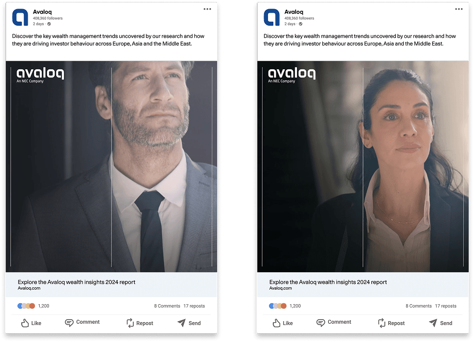
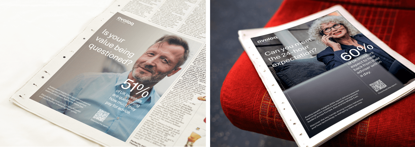
The goal was not to reinvent but to apply the new brand intelligently. We worked within the structure of each report, making adjustments that collectively elevated the reading experience, adhering to the new grid system and clarifying hierarchy for content. New imagery was sourced to highlight the experts, the world around us and technology in a fresh fintech way as per the new brand guidance.
With no print requirement, our focus was 100% digital, allowing us to optimise the files for readability on screen, reducing clutter, sharpening contrast, and ensuring spacing was appropriate for scrolling experiences.
After an iterative process that saw the teams on both sides collaborate and set new rules to roll out across all future reports, the revised reports were ready to be published on Avaloq’s website.
Consistent, structured reporting
Each report now reflects Avaloq’s evolved identity: structured, confident, and user-friendly. Whilst subtle, the finer details significantly improve the clarity, consistency, and brand cohesion. The result is a suite of reports that supports Avaloq’s credibility while delivering a cleaner, more professional experience for its global audience.
This project was a quiet but important step in Avaloq’s larger brand evolution. To ensure consistency, we also documented the specific guidance for reports to inform future designs. In bringing these reports up to standard, we helped strengthen the brand’s digital presence – one carefully aligned column at a time.
Related projects