Worldpay
Worldpay Brand Refresh
Meet the ‘new’ Worldpay
- Multi-award-winning refresh of a leading global payments brand
- Engagement up 50%
- 100% hike in social shares
For over three decades, Worldpay has led the global payments industry, processing more than $2.3 trillion annually across 60+ payment methods for over one million merchants in 174 countries.
In May 2025, Worldpay’s marketing team partnered with ifour to refresh the brand to ensure it remained vibrant, trusted, and relevant in a rapidly evolving market. The ambition was to engage a broad spectrum of merchants while reinforcing Worldpay’s deep understanding of the challenges businesses face in managing payments.
– Branding
– Campaigns
– Video Design
– Events
Balancing the human touch with technical innovation
A comprehensive brand audit uncovered a powerful truth: Worldpay is rightly famous for its customer-centric ‘human touch’ but its identity needed to do a better job of championing its constant technological innovation. The brand had to speak equally to global enterprises and independent local merchants, uniting them under a single, confident story of innovation and reliability.
Expert storytelling
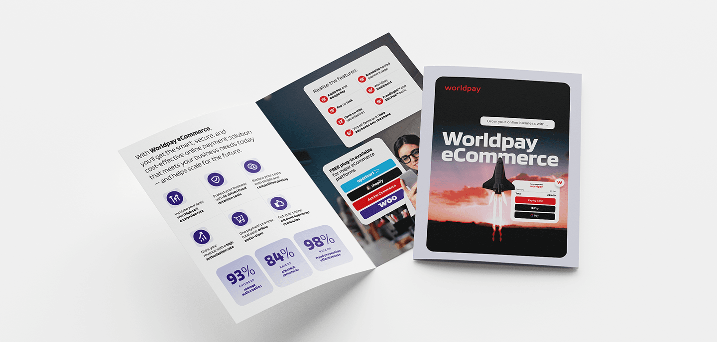
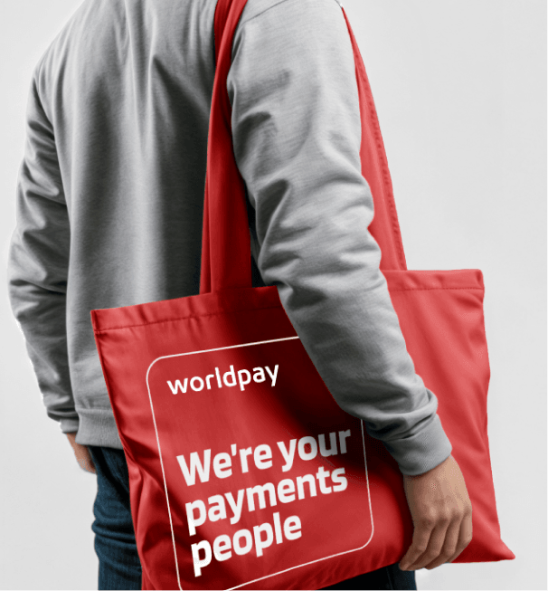
As Worldpay’s creative branding partner of three years, ifour reimagined the brand from the ground up. Collaborating closely with the in-house team, the agency modernised every element, transforming the iconic Worldpay ‘W’ into a central visual character and refining the colour palette and typography to provide more punch and clarity. The distinctive Worldpay ‘card’ became a storytelling anchor, while the visual identity of its growing product suite, which has grown through both innovation and acquisition, was harmonised into a cohesive family of products.
A brand that turns heads
In the first six months after launch, results exceeded expectations:
- Engagements up nearly 50%
- Post link clicks increased by 54%+
- Shares almost doubled
- Comments up over 70%
Audiences didn’t just notice the new brand, they actively engaged with it. The refreshed identity sparked conversation, inspired advocacy, and deepened connection with Worldpay’s story.
The refresh has also supercharged recruitment, with organic content driving a fivefold increase in the likelihood of engaged followers becoming Worldpay hires.


This brand refresh has made Worldpay more relevant, more compelling, and more connected than ever, balancing its trusted human touch with the technological innovation that defines the future of payments.
The Worldpay brand refresh won 10 awards at the Titan Brand awards 2025.

